Sunglasses can’t keep up.
Health & Wellness | Packaging
Overview
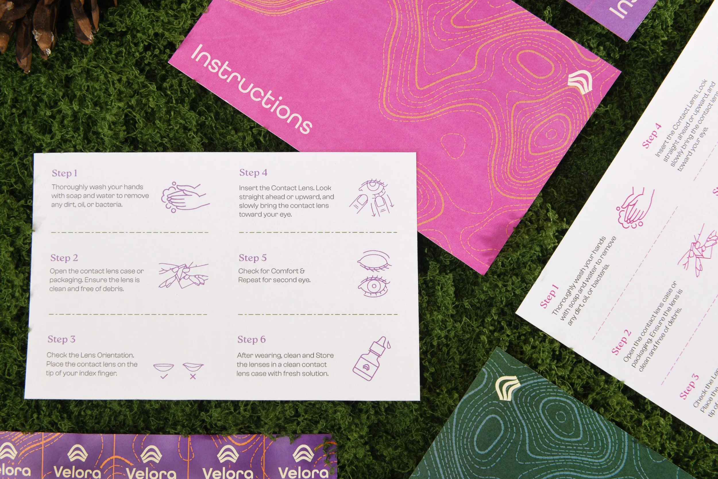
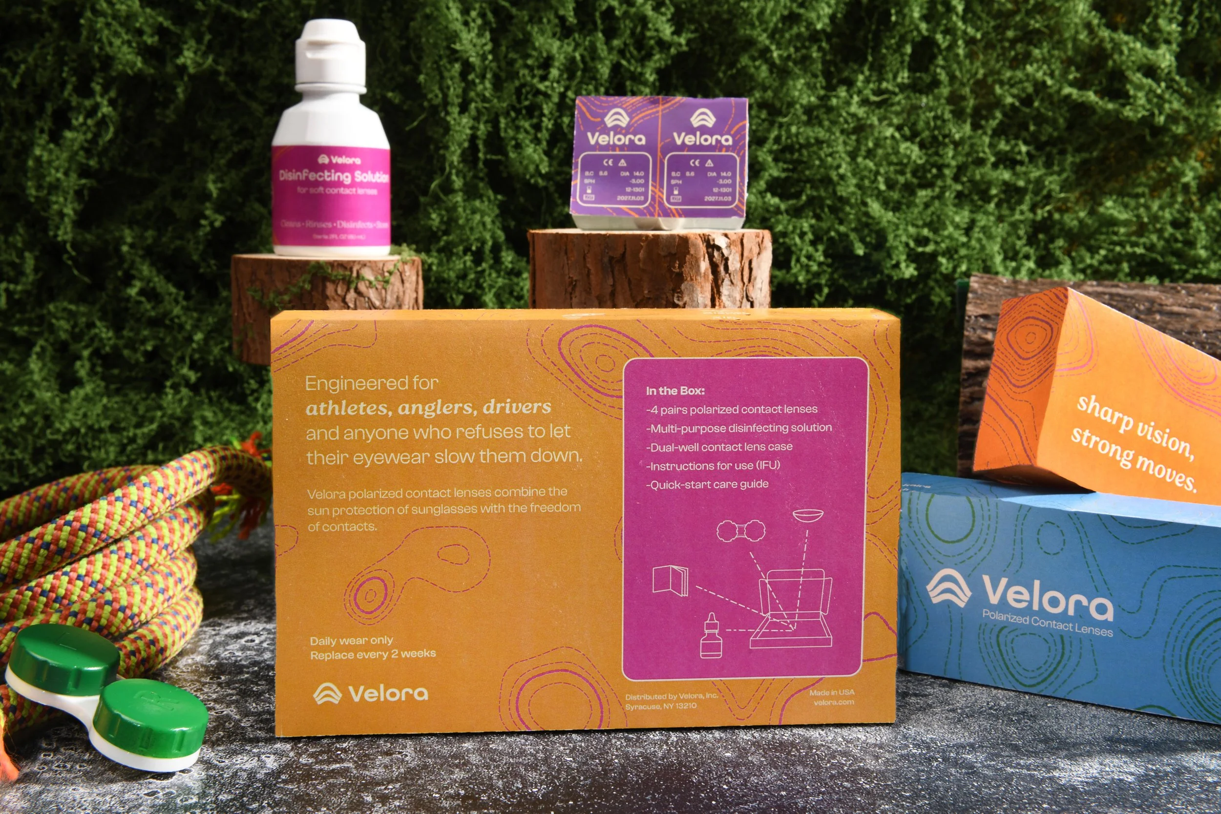
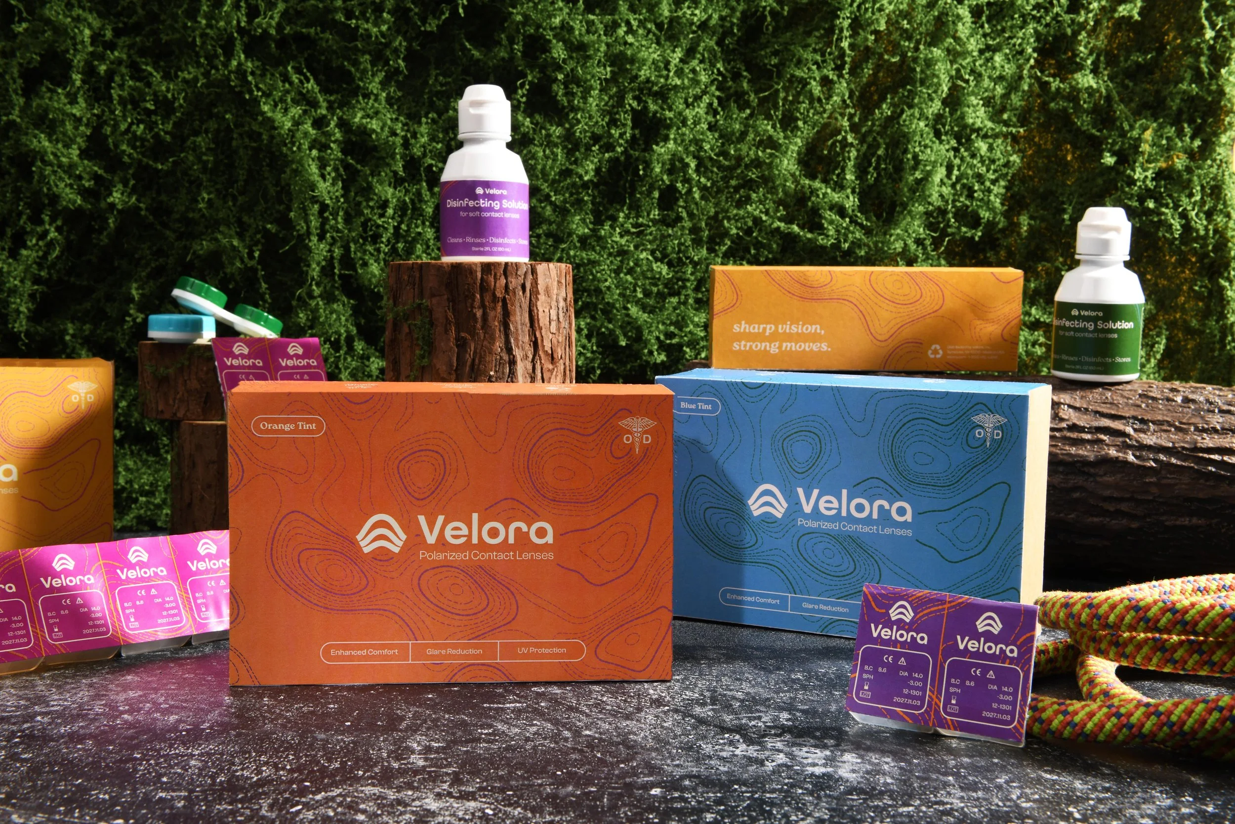
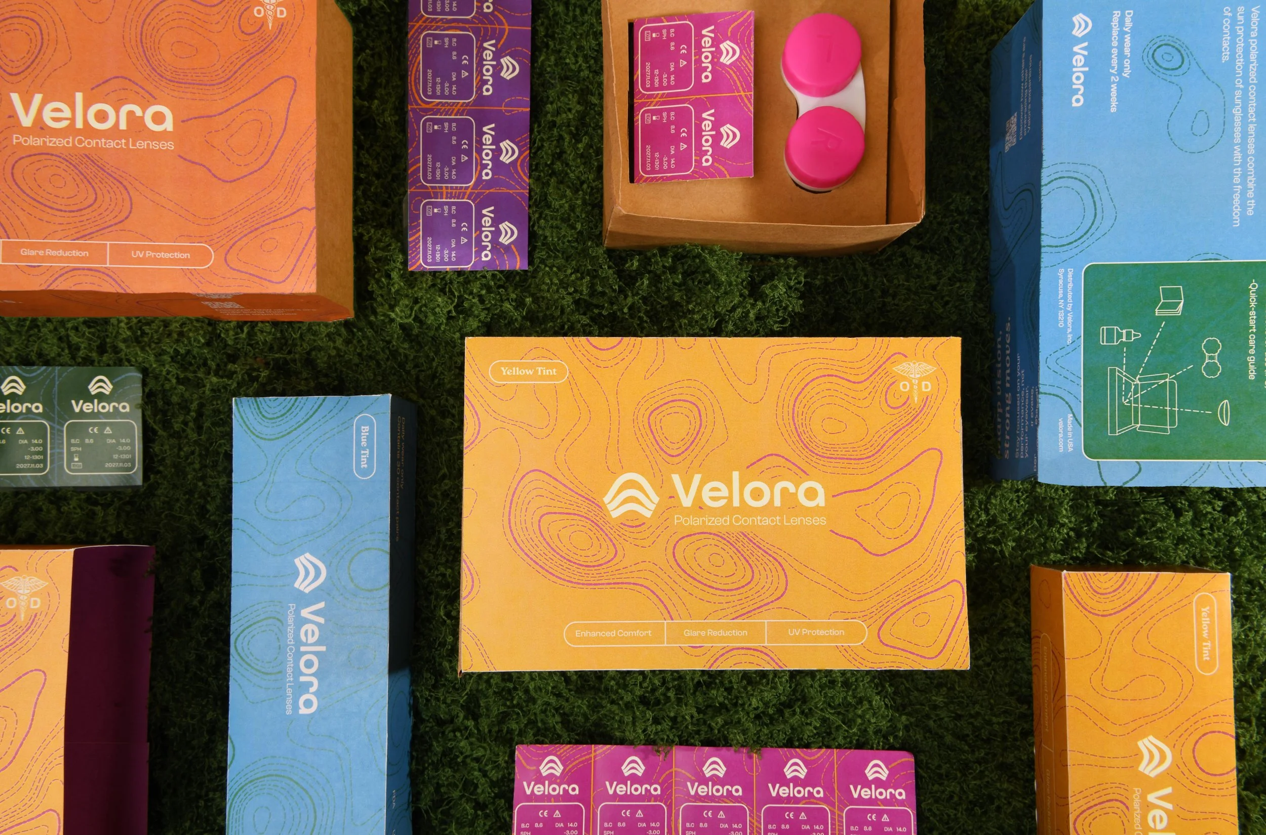
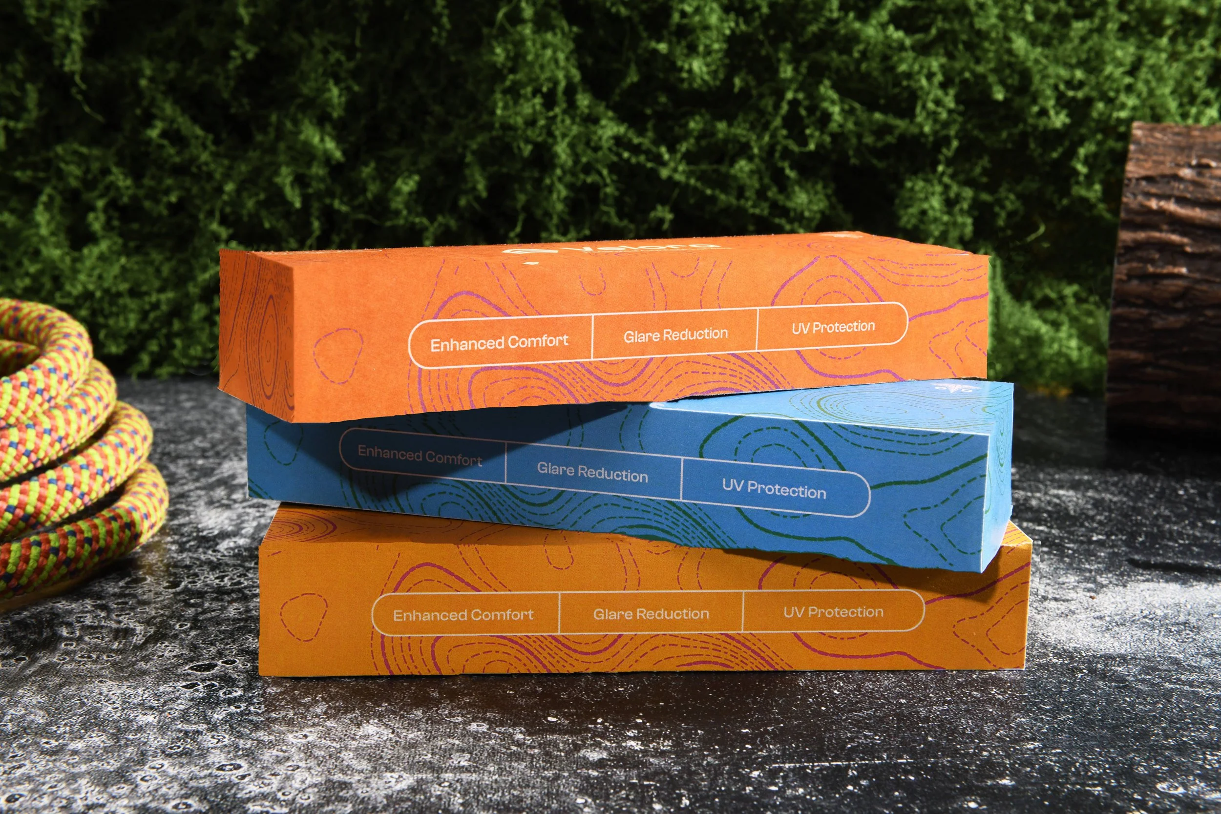
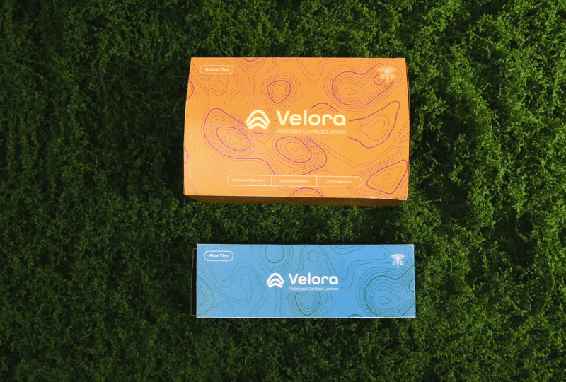
Velora is a line of polarized contact lenses that does what sunglasses can’t, stay put. Designed for athletes, adventurers, and anyone who’s ever lost their glasses mid-stride, Velora combines the highest available UV protection with polarized glare reduction in a lens you simply put in and forget about.
Scope
+ concept + brand identity
+ naming + copywriting
+ research + creative strategy
+ packaging + collateral
-
Sunglasses slip. They fog, break, and for anyone who needs vision correction, they add a second problem to an already demanding situation. Sport sunglasses, transition lenses, clip-ons — every solution asks for a compromise. The question was simpler: what if nothing was in the way at all?
-
The most frustrated eyewear users aren't casual — they're people whose performance depends on unobstructed vision. Each has a different relationship with glare and UV exposure. All of them need the same thing: eyes that work with them. That reframe shaped everything. Velora isn't a lens with a feature. It's a replacement for a whole category of gear.
Answer
The brand identity is built around motion and clarity — dynamic, directional, confident without being aggressive. The name Velora suggests velocity and vision without leaning into tired athletic branding tropes.
Packaging uses three tints: Brown, Black, and Yellow, each mapped to specific environments and distributed where the target audience already shops: REI, Dick’s Sporting Goods, local pharmacies. The packaging has to work on a shelf next to gear, not next to eye drops, so the visual language skews performance over clinical.